
All Projects
A compilation of my works from recent years. Select any card to view its details.

No projects to show yet.
Book Redesigns
1 / 6
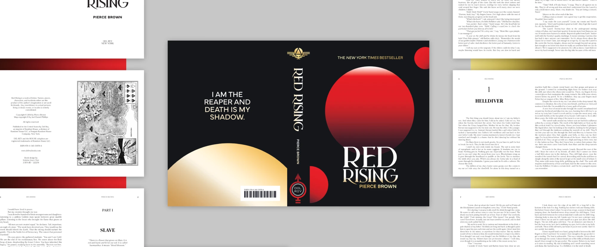
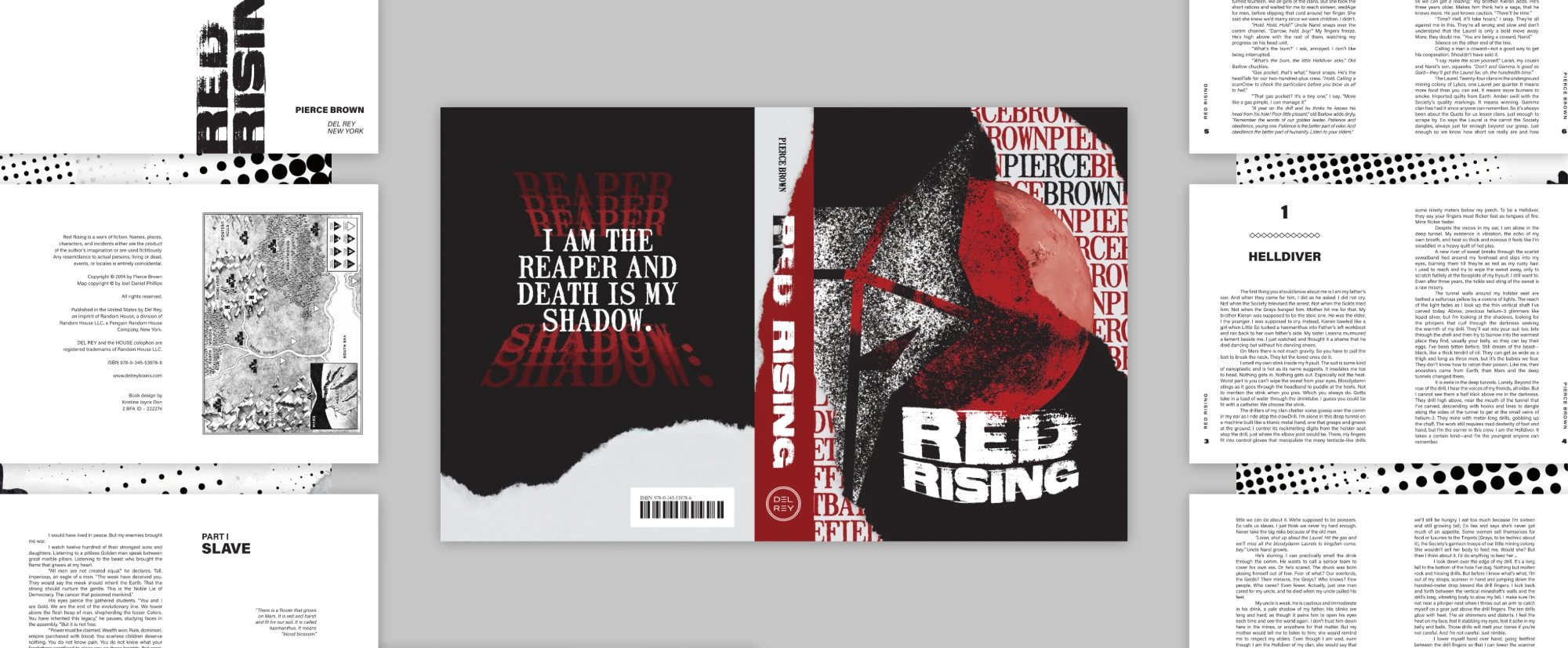
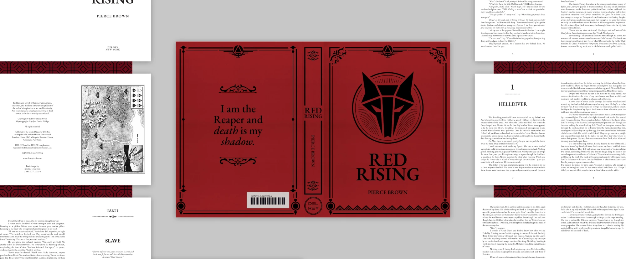
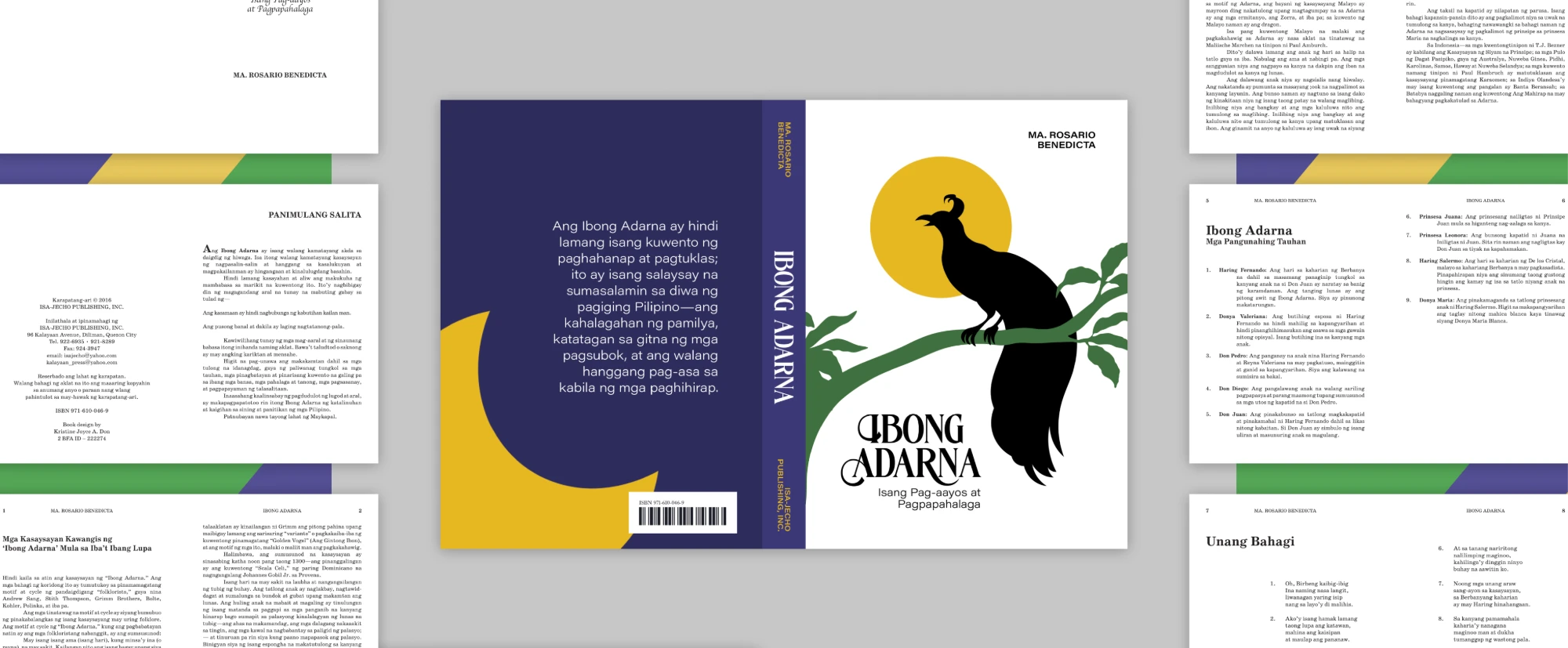
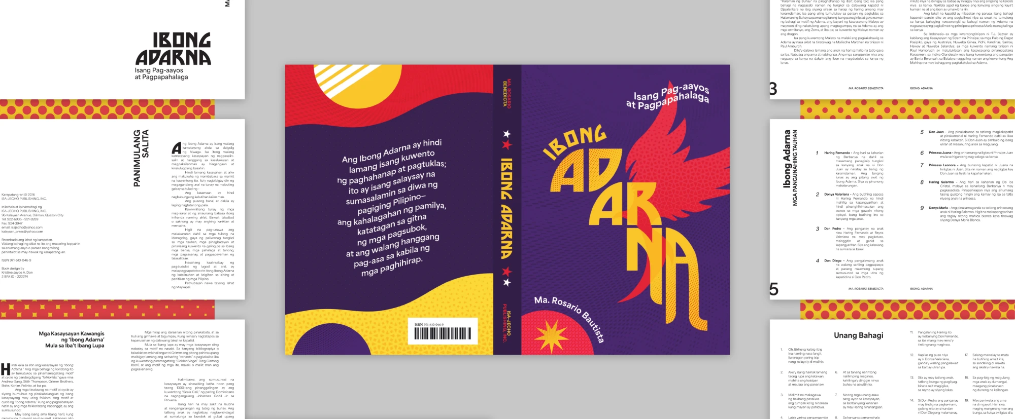
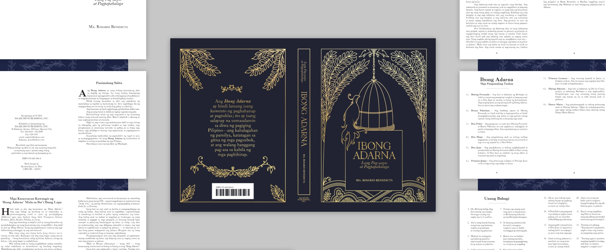
Book Redesigns began with a brief: to redesign two books, each in three different styles. I selected Ibong Adarna as the Filipino title and Red Rising as a title of my own choosing.
Highlights
- Modern: clean sans-serif type with one bold shape on each cover
- Postmodern: tilted, stacked type, halftone dots and torn paper
- Classic: ornamental frames and serif type
- Each design is a complete book: covers, endpapers and at least 10 inner pages
Amplify Magazine
1 / 8
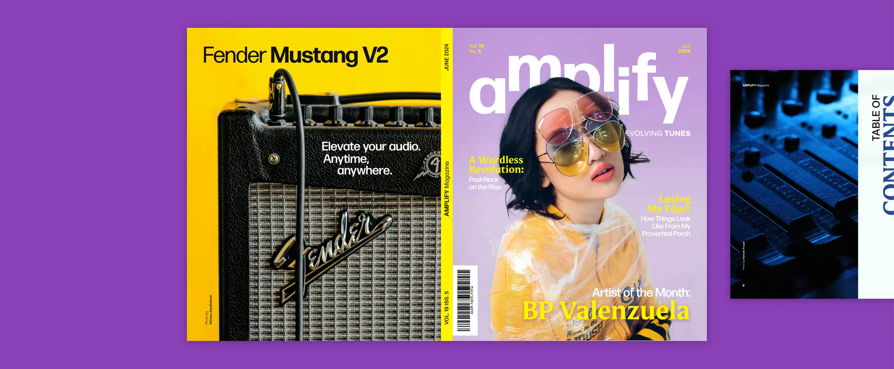
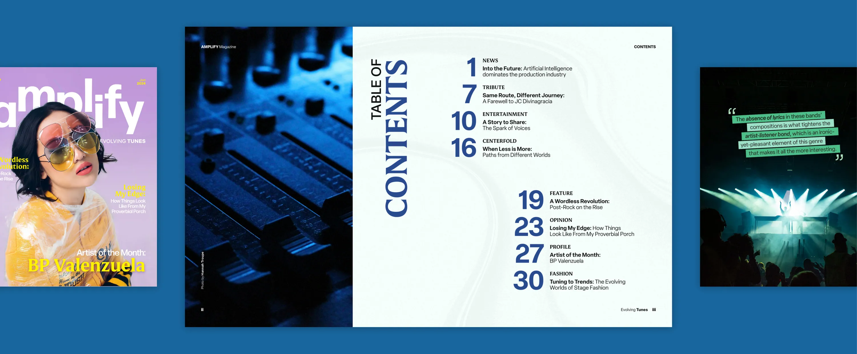
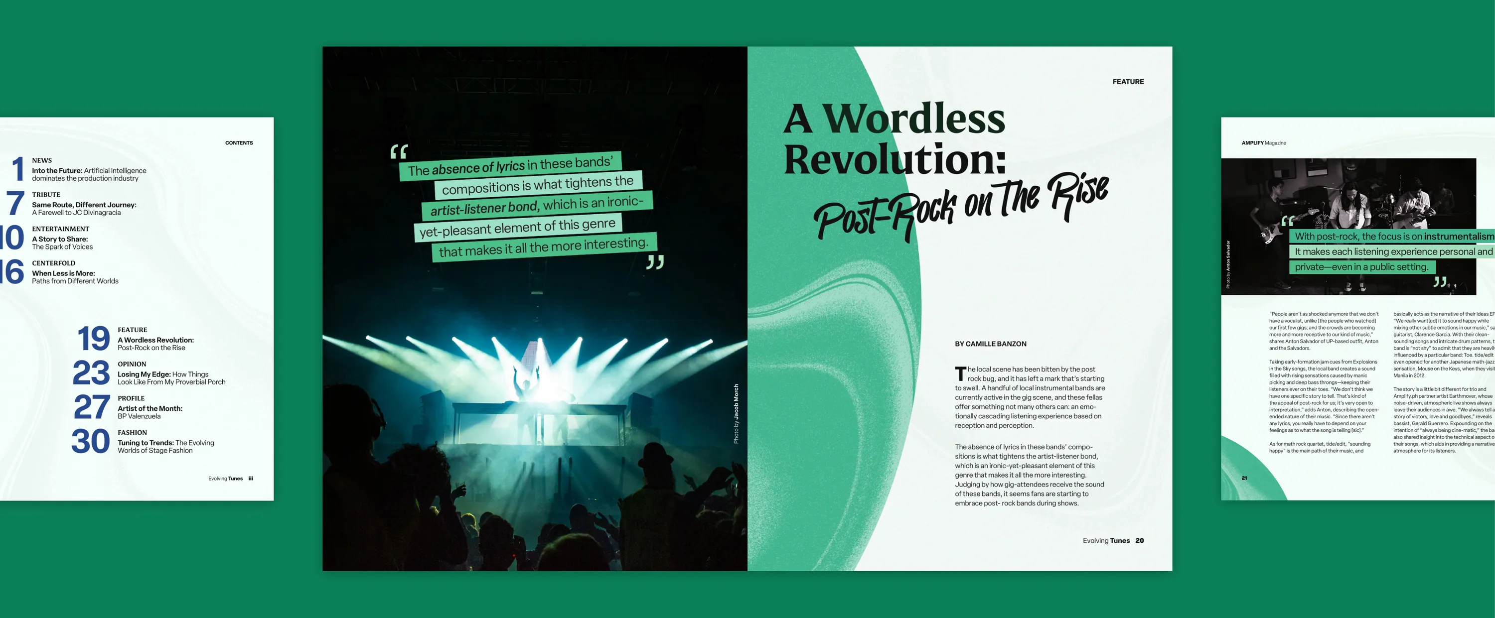
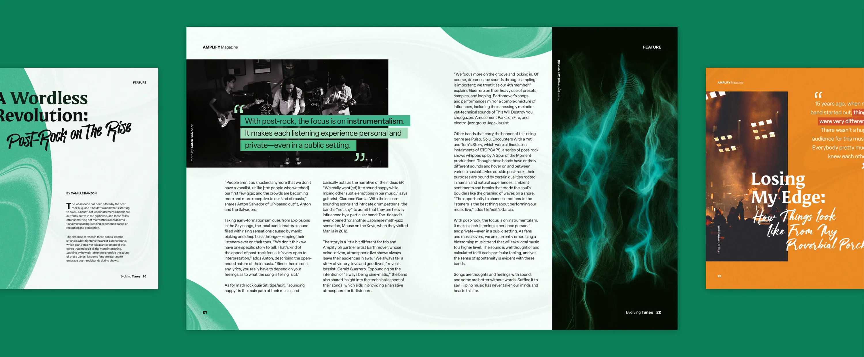
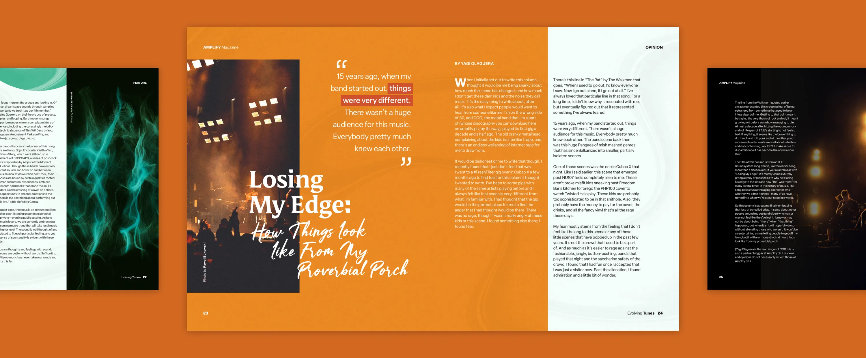
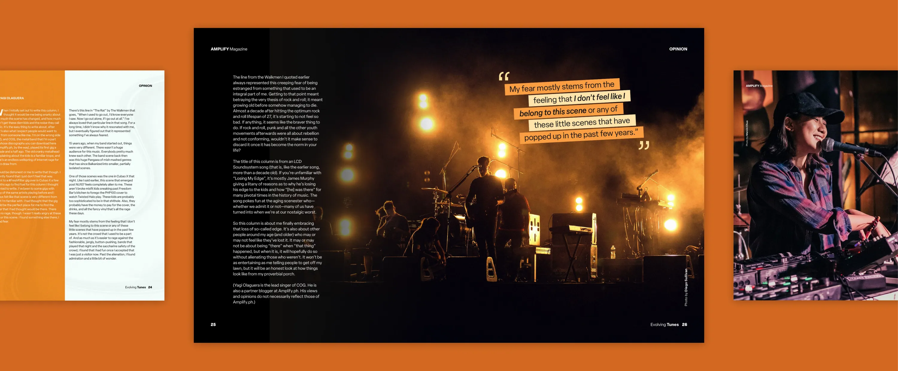
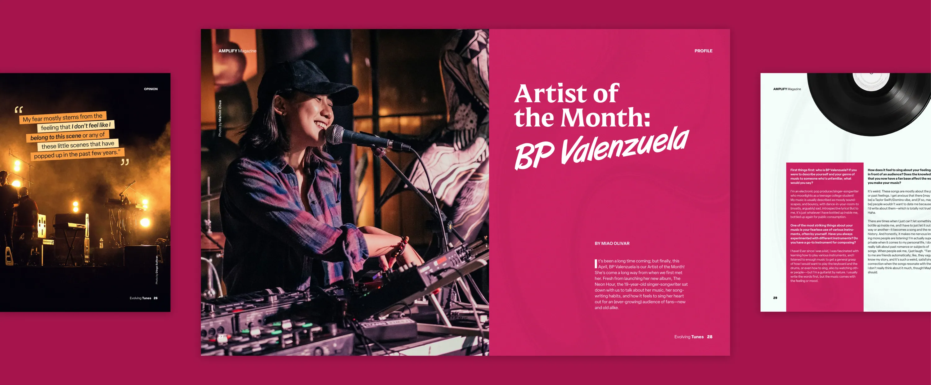
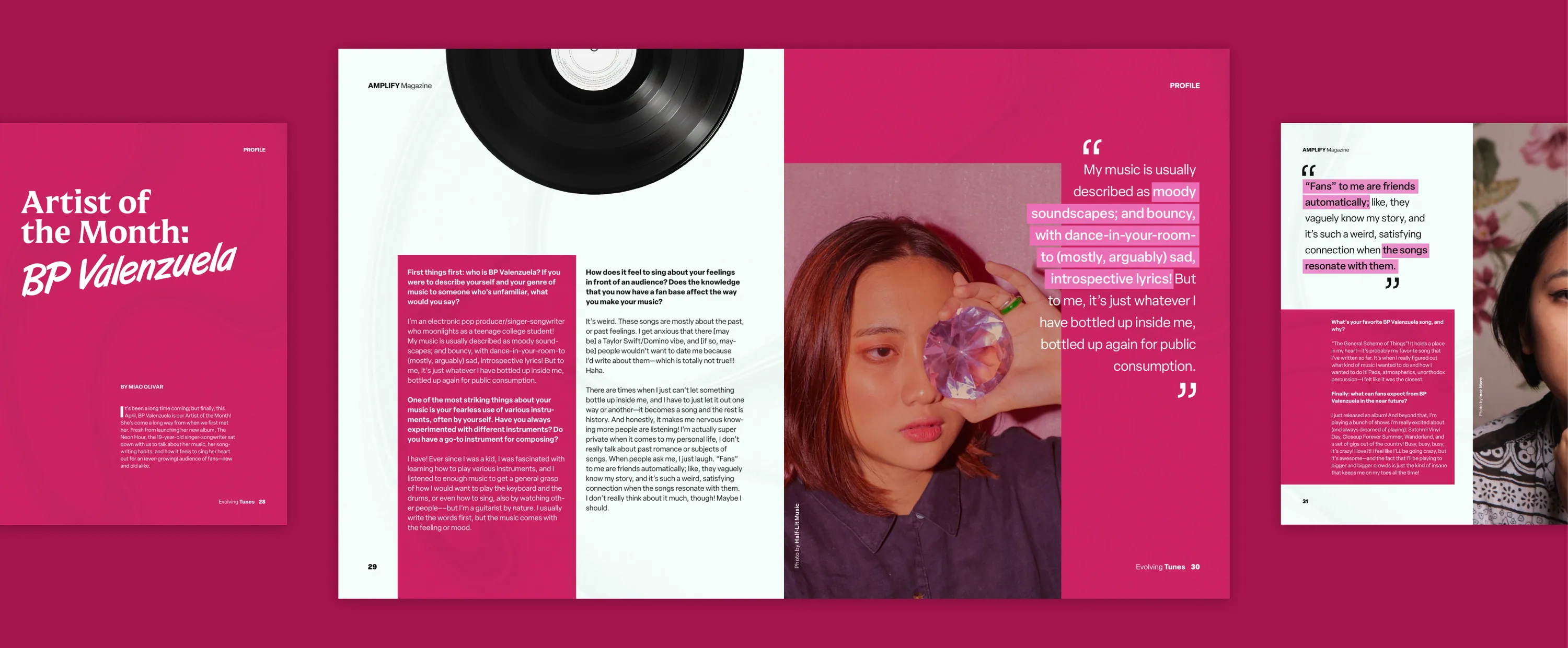
Amplify Magazine is my midterm output: a music magazine themed Evolving Tunes, laid out in InDesign.
Highlights
- Technical focus: graded in detail on InDesign fundamentals, such as paragraph styles
- Color-coded sections: blue contents, green feature, orange opinion and magenta profile
- Type system: serif display titles, brush-script subtitles and sans-serif body text
- Pull quotes: angled, highlighted lines
CD-R King

1 / 2
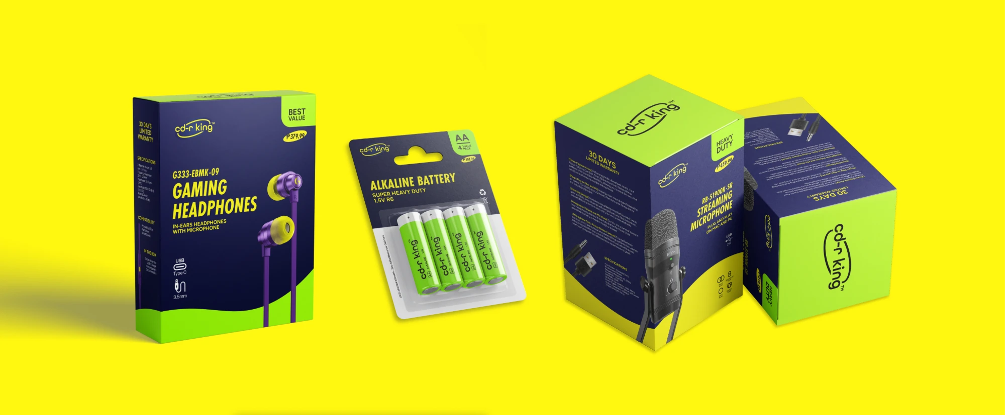
CD-R King is a rebrand of a Filipino tech retailer with a dated image. For my group’s finals brief, I designed the logo, packaging and typography.
Highlights
- Analysis: traced its dated image to its products, service and visuals
- Logo: the brand’s oval, tilted 20°, with full-color and mono versions
- Packaging: sample boxes for headphones, batteries and a microphone
- Palette: neon yellow and green on a darker navy
Bluey Poster

Bluey Poster portrays my dogs, Wanda and Cairo, in the art style of the series Bluey. It is also a tribute to Cairo, who has passed away and appears as an angel.
Highlights
- Style study: analyzed existing Bluey posters for palette, line weights and outlines
- Title lettering: a similar typeface, modified to match the show’s title
- Challenge: illustration is not my usual practice, so this was a chance to learn
- Process: documented, as the course required
Flaire
1 / 2
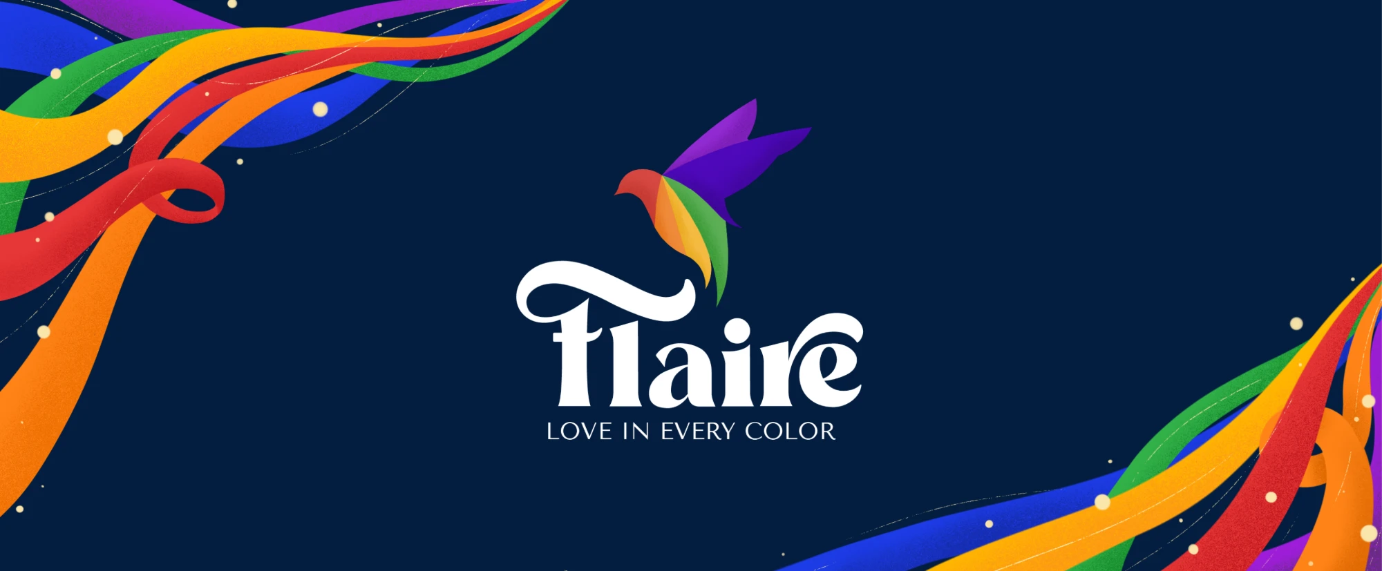
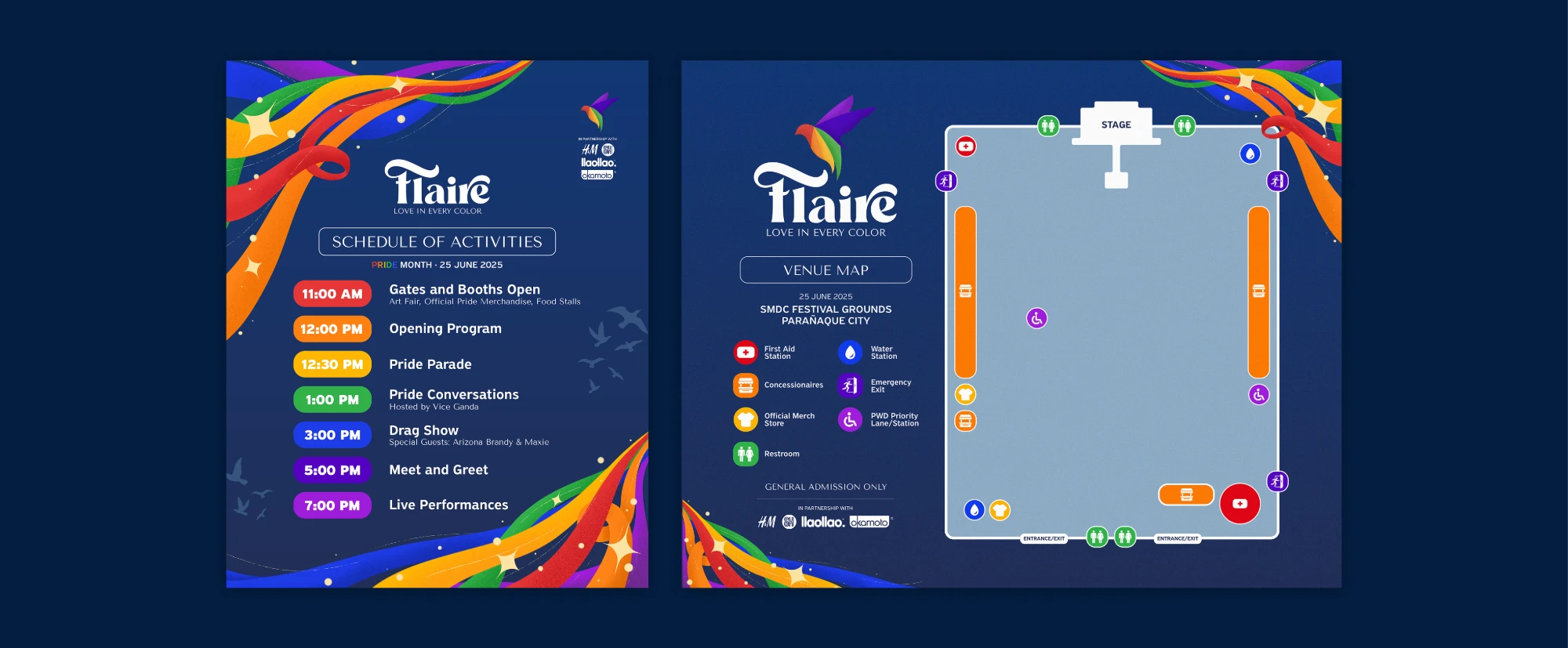
Flaire is a pride month event proposal themed “Love in Every Color”. With a partner, I designed the logo, event map, schedules and merchandise.
Highlights
- Concept: “flair” for individuality, “flare” for freedom, shown as birds and ribbons
- Logo: a bird in flight, each feather a different color for diversity
- Wordmark: Reikna, with custom curves
- Materials: event map, color-coded schedule and merchandise in one palette
Gold of Ancestors
1 / 3
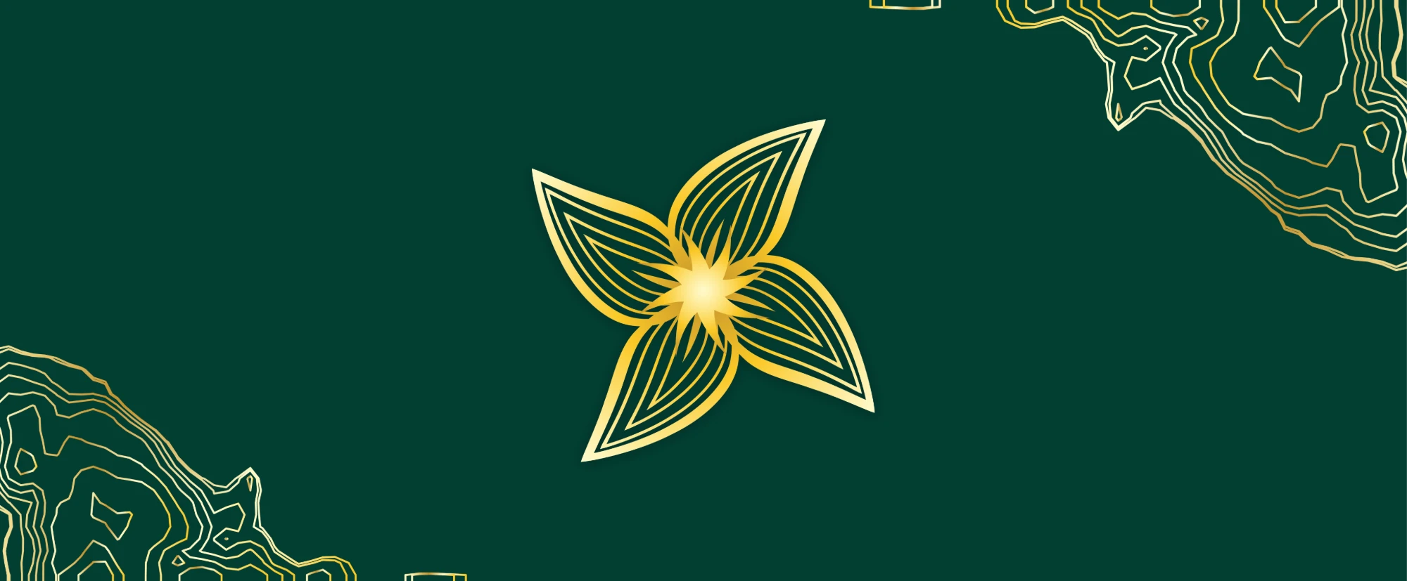
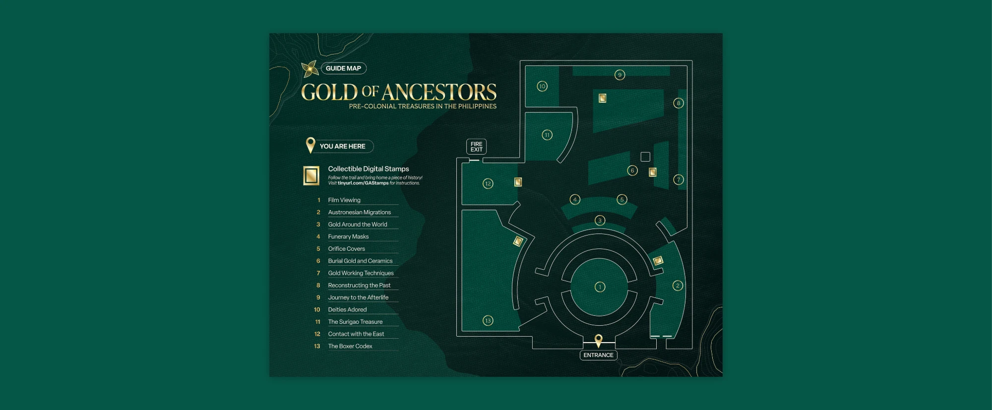
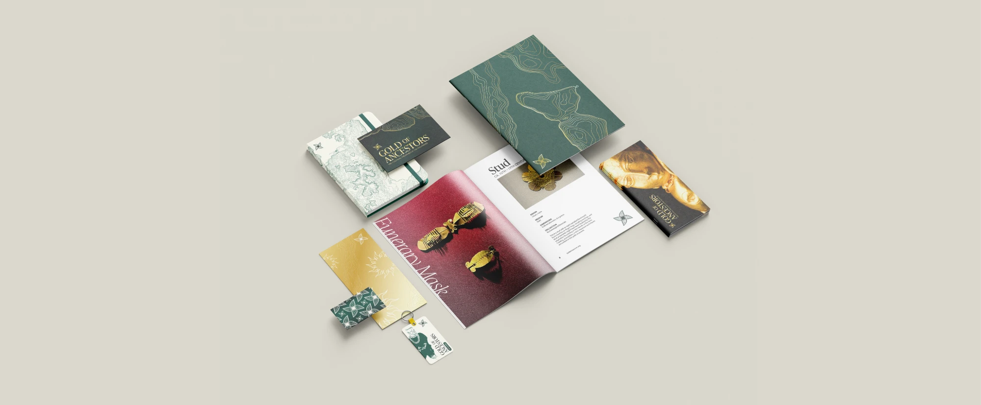
Gold of Ancestors is our group’s entry to rebrand an Ayala Museum exhibit. I designed the logo, stationery set and exhibit map, and chose the colors and typefaces.
Highlights
- Colors: dark jade for earthly abundance and white gold for divinity
- Topography: contours of the discovery sites, such as Surigao and Butuan
- Typefaces: IvyPresto Headline, Tiller and Elza
- Brand voice: organic, aureate and intricate, yet warm and approachable
Jamie’s World
1 / 4
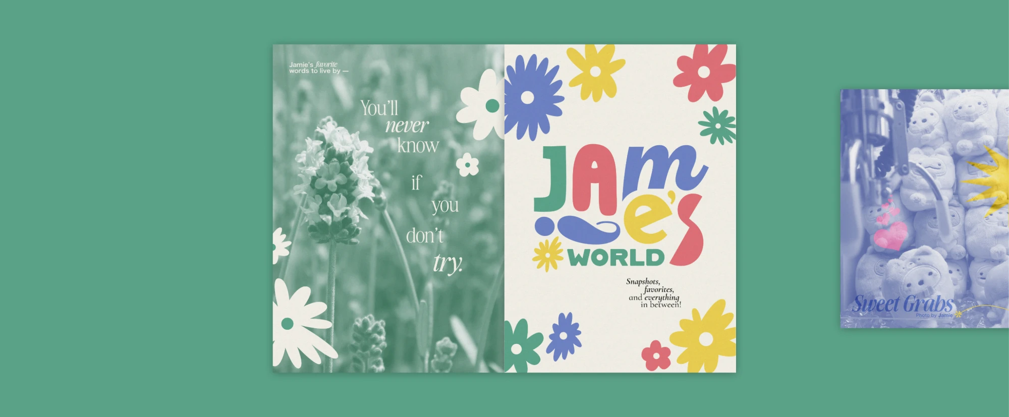
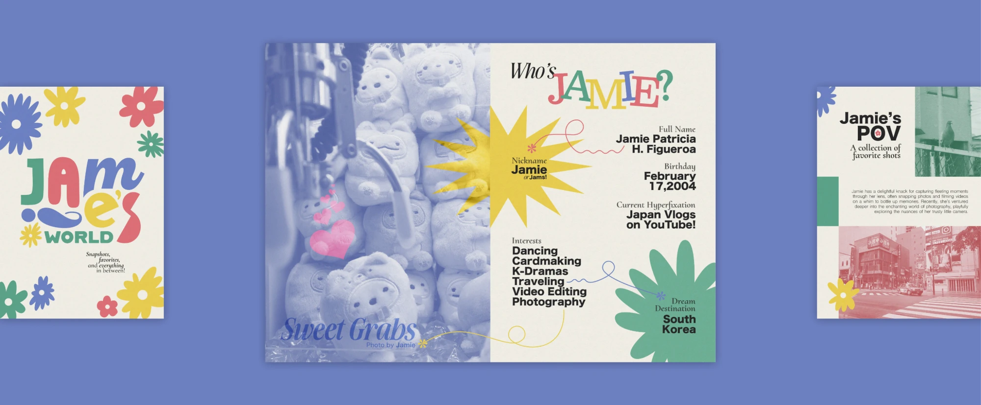
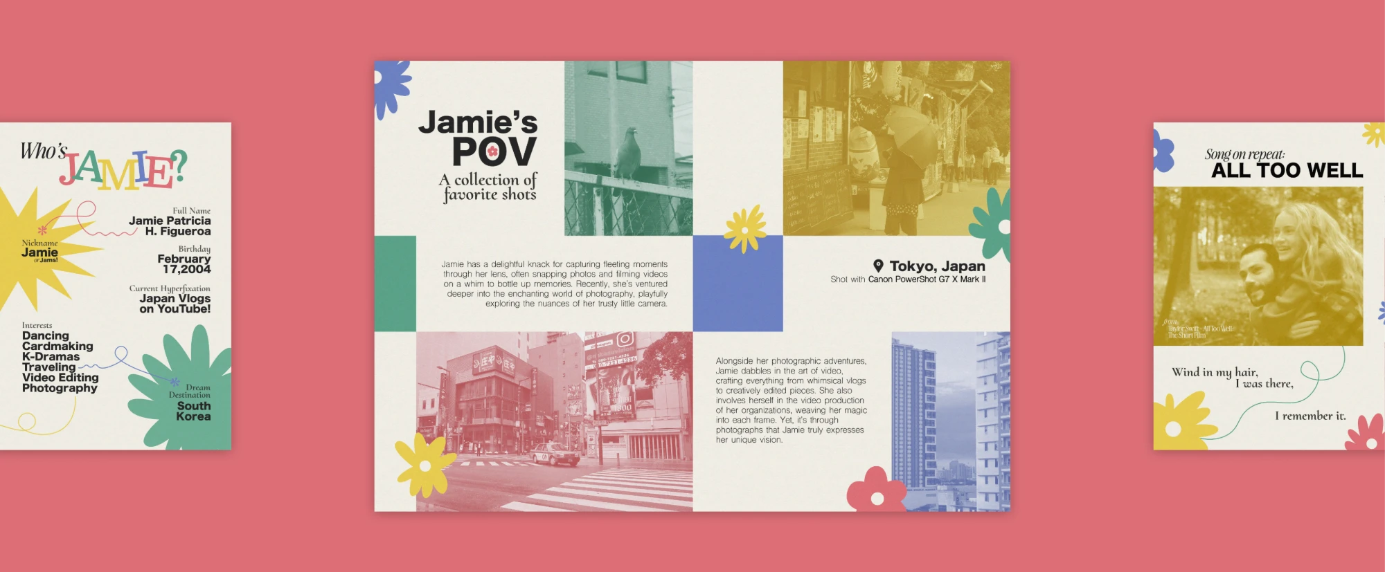
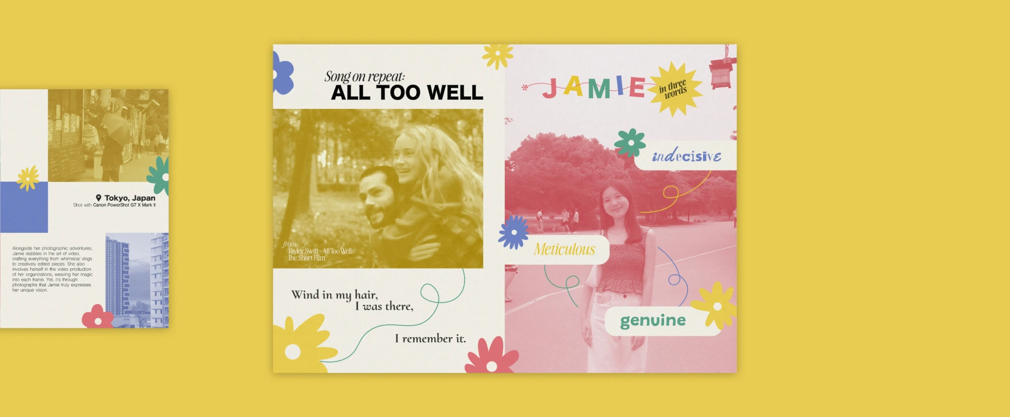
Jamie’s World is a five-spread digital zine about my friend Jamie. We were paired in class and each made a zine about the other, so the layout had to reflect who Jamie is.
Highlights
- Personality: each spread shows a side of Jamie, from a profile to a favorite song
- Photos: Jamie’s own, in duotone
- Typography: rounded display lettering with script accents and a clean sans-serif
- Palette: pastel blue, yellow, green and red, with flower shapes
Brother iPrint & Scan
1 / 2
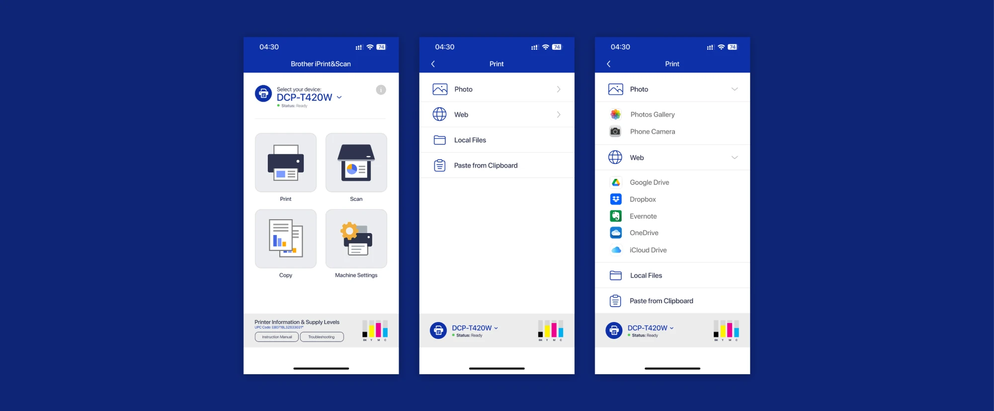
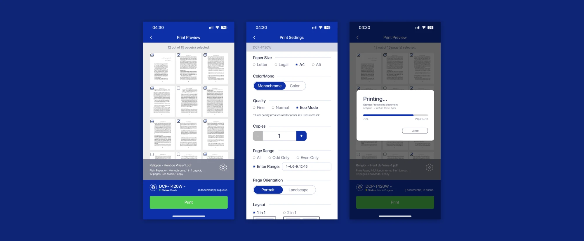
Brother iPrint & Scan is a redesign of the printing app’s confusing document flow. I simplified how files are chosen and put all print settings on one screen.
Highlights
- File sources: four accordion categories replace a confusing list
- Settings: paper size, copies, orientation, page range and color on one screen
- More control: page ranges, supply levels
- Clearer layout: small illustrations explain options, with refined spacing
HeritageFinds
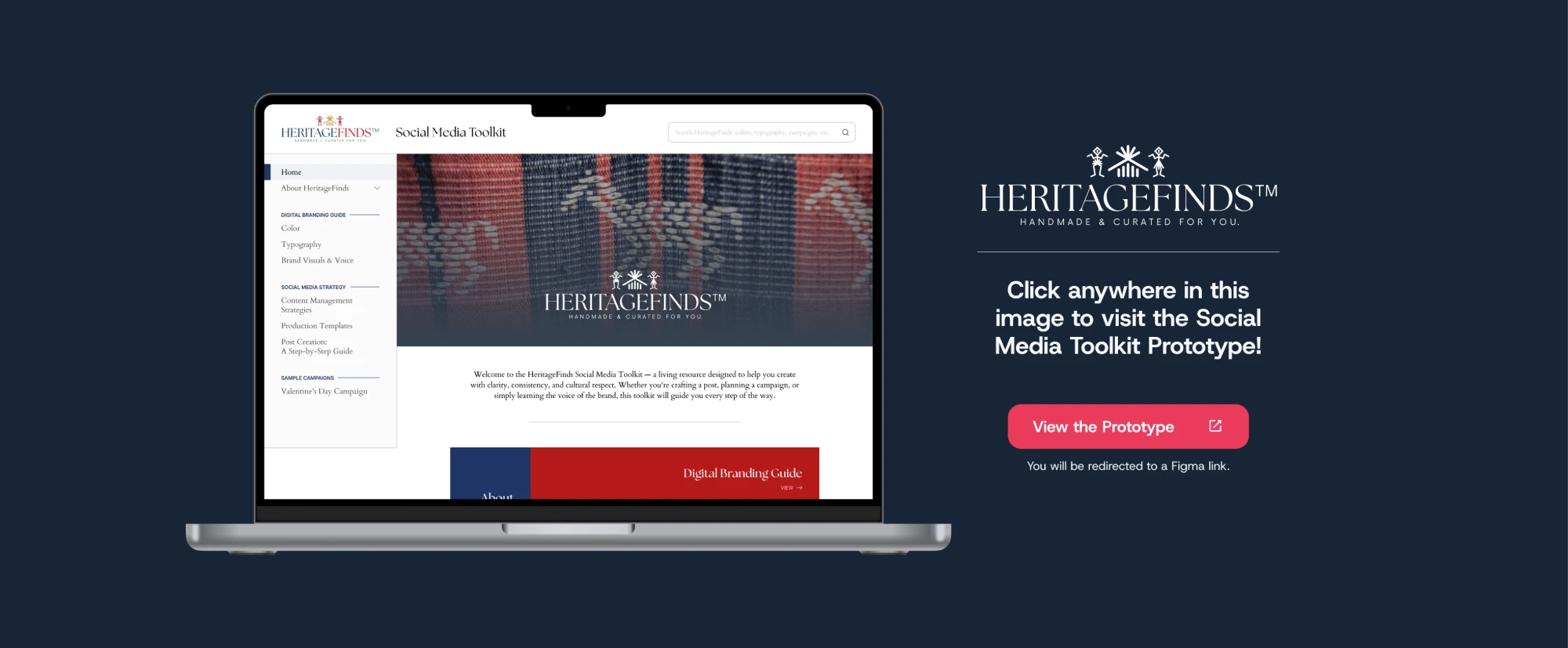
HeritageFinds is a social media toolkit website for a Filipino clothing company. I designed the entire interface and wrote much of the content.
View the Prototype (opens in a new tab)
Highlights
- The proposal: a social media management system, placed second in the class pitch
- Branding guide: color, typography, visuals and voice in a searchable site
- Social strategy: content management, production templates and a post guide
- Sample: a Valentine’s Day campaign
Bramble
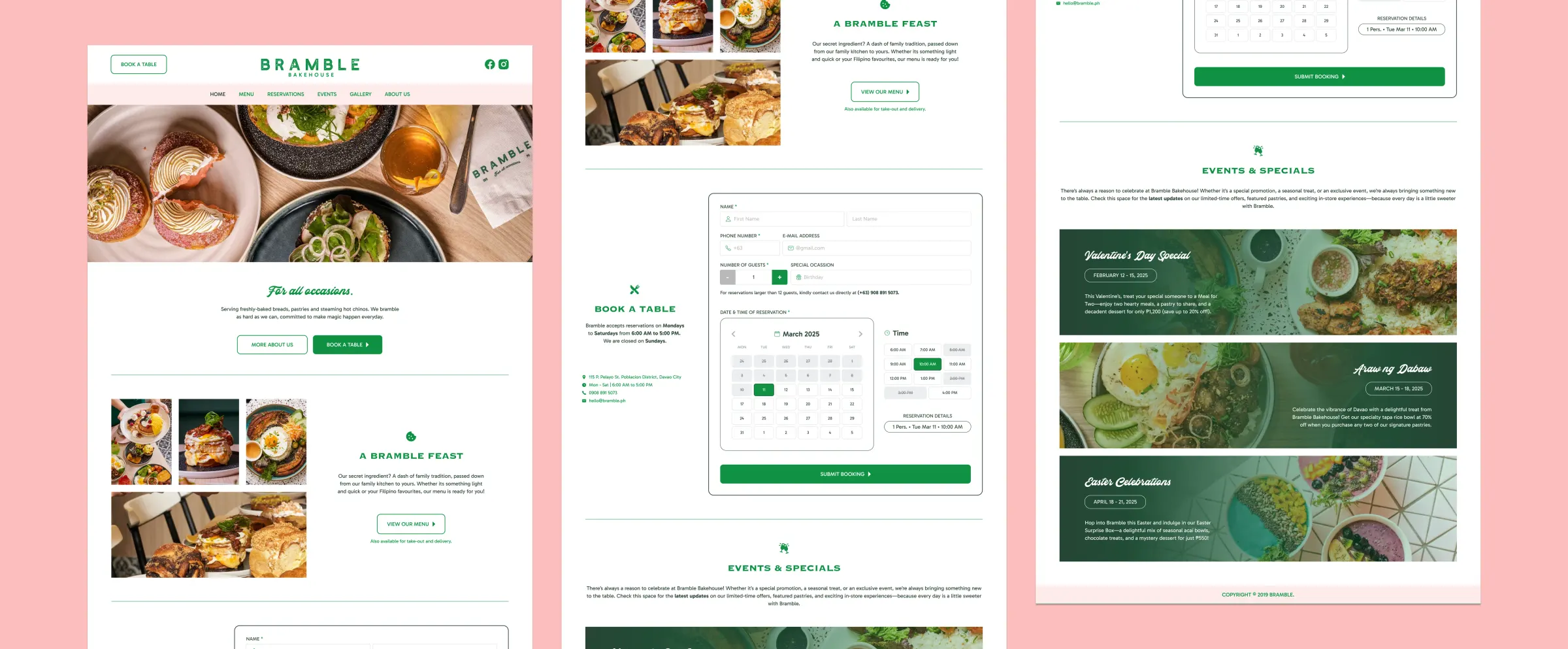
Bramble is a concept website and reservation system for a popular Davao brunch restaurant with no online booking. I kept its branding and designed everything else from scratch.
Highlights
- Booking first: “Book a Table” leads to a simple calendar and time-slot form
- Audience: clean, minimal and photo-led, as guests find Bramble on social
- Events: a section for regular deals
- Brand match: Bramble’s own logo and photos, a matched palette and my typeface